How to Do Minitab Homework
Using Excel and the QI Macros
Students often call or email us about homework assignments. We usually tell them to select their data and use the Chart, Control Chart, PivotTable or Stat Wizard to get the desired answer. One student recently offered to pay us to do his homework in Minitab®. While I draw the line at teaching people how to use Minitab, I realized that the QI Macros could help most students figure out what chart or statistic to use.
Homework
The student's assignment was to analyze call center call time data to compare Team A and Team B (columns A:B). Team A had also done an improvement project (column C).
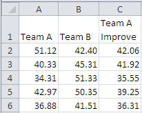
NOTE: The sample data shown above is not the entirety of the data set. If you run statistical analysis using this portion only, f-Test and t-Test outputs will not match what is shown below.
Questions about the data included:
- What statistical test would you use on this data?
- What does this data tell you about Team A and Team B?
- Is Team A's improvement representative?
- What would you recommend should happen in Team A and Team B?
- Is the process stable?
How to Determine What Test to Use on the Data
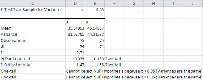
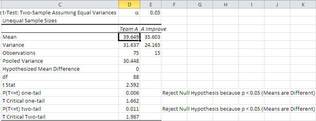
If you copy the data from Minitab and paste it into Excel, you can then select Team A's and Team B's data and use the QI Macros Statistics Wizard to choose tests for you.
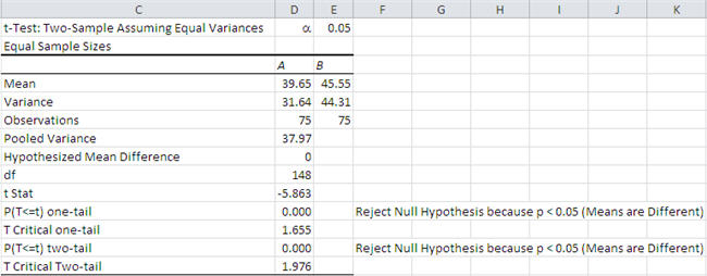
First, it will choose an F-Test to analyze the variances. Then, because the variances are not different, it will choose the t-Test for means with equal variances. After the QI Macros Statistics Wizard has helped identify the right tests, replicate the t-Test using Minitab's statistics assuming equal variances.
How to Answer the Question: "What does this tell you?"
If you look at the QI Macros analysis, you'll see that the "Means are Different" but the variances aren't statistically different. Team A and B have statistically different call times.
How to Answer: "Is Team A's improvement representative?"
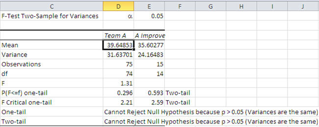
If you select column A and column C (Team A before and after) and run the QI Macros Statistics Wizard, you will find that the "Means are Different", meaning that the improvement was statistically different. The variances aren't statistically different.
What would you recommend should happen in Team A and Team B?
QI Macros can't help you here, but Team A has shorter call times with the improved process, so they should sustain the improvement (i.e., implement a system to control and monitor performance).
Team B should replicate Team A's solution to reduce call times.
How to Answer: "Is the process stable?"
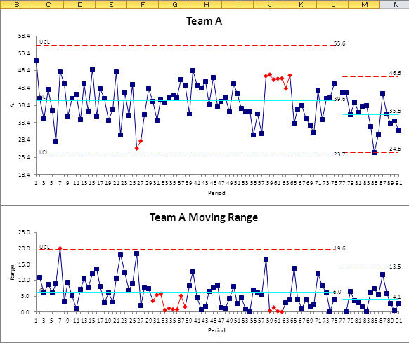
If you stack Team A's data (baseline and improved) and leave a space inbetween, you can then select the data and use the QI Macros Control Chart Wizard to help select the right chart (XmR).
QI Macros will create a moving range (mR) chart and an X chart (notice sheet names at the bottom of Excel's window):
![]()
The red points indicate that the process is unstable (i.e., out of control).
Note: By default, Minitab often shows only points outside of the UCL/LCL as out of control. QI Macros show additional unstable conditions.
Notice Team A's improvement:
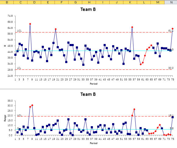
Select Team B's data and use the QI Macros Control Chart Wizard to select the right chart (XmR). Red points show that Team B is also unstable:
You can easily do your statistics and Six Sigma homework using the QI Macros for Excel Control Chart and Statistics Wizards. Then used the insights gained to do your homework in Minitab.
To learn more about Breakthrough Improvement with the QI Macros and Excel, get my new book (click here) and watch the supporting videos (click here).
Join 100,000+ Users
in 80 Countries
![]()

KnowWare International, Inc.
2696 S. Colorado Blvd., Ste. 555
Denver, CO 80222 USA
Toll-Free: 1-888-468-1537
Local: (303) 756-9144