SPC Charts Used in Labs
The Levey Jennings chart and Youden plot are popular with lab professionals
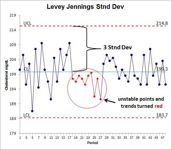
- Levey Jennings control chart is used to monitor key measures of health such as cholesterol and glucose.
- Youden Plot is used by labs to compare two runs within the same lab or two runs between labs.
Levey Jennings Standard Deviations Chart
The Levey Jennings chart, unlike other control charts, uses standard deviation instead of sigma to calculate control limits.
How to Create a Levey Jennings Chart in Excel:
- Organize your data into one column or row
- Click and drag over your data to select it
- Click on the QI Macros menu, then Control Charts, then Levey Jennings chart
- The Levey Jennings chart consists of:
- A line graph of each data point
- An average line
- 1-2-3 standard deviation lines
- Unstable points or conditions will turn red
Learn more about Levey Jennings Control Charts
Youden Plot
Here is an example of a Youden Plot comparing five labs who conducted two runs on the same product.
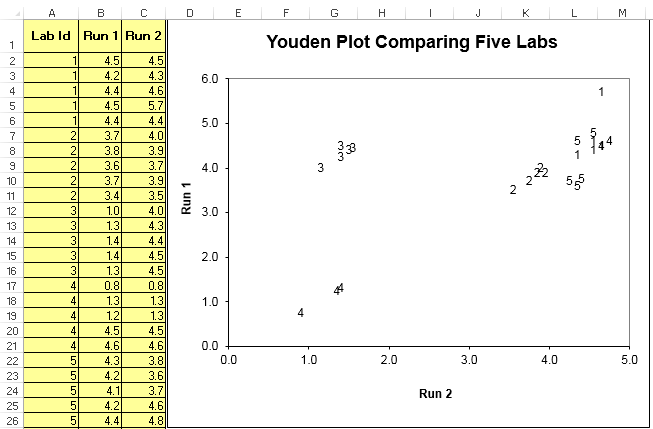
How to Create a Youden Plot using QI Macros Excel template:
- Input the Lab id in column A
- Input data from Run 1 in column B
- Input data from Run 2 in column C
Interpreting the results:
- Lab 4 is biased low.
- Lab 3 had inconsistency between run 1 and run 2.
- Lab 1 has one outlier.
Join 100,000+ Users
in 80 Countries
![]()

KnowWare International, Inc.
2696 S. Colorado Blvd., Ste. 555
Denver, CO 80222 USA
Toll-Free: 1-888-468-1537
Local: (303) 756-9144
©
1997 - 2024 KnowWare International Inc. All Rights Reserved. Legal Info | Terms of Use