Graphical Excellence
I've recently had the good fortune to stumble across Edward Tufte's books on the Visual Display of Quantitative Information (Graphics Press 2001). Tufte offers insights into how to best display information for maximum effect and easy of comprehension. Graphical excellence, Tufte insists, consists of:
- well-designed presentation of data of substance, statistics and design
- complex ideas communicated with clarity, precision and efficiency
- the greatest number of ideas in the shortest time with the least ink in the smallest space.
While Tufte focuses on graphical artists who present data in newspapers and magazines, his insights apply to the Six Sigma Green Belt and Black Belts as well.
Tufte says: "Many graphic artists believe that statistics are boring and tedious." Many people believe this too, but Tufte continues: "if the statistics are boring, then you've got the wrong numbers."
In the Beginning
I've never given it much thought, but using graphs to show numbers is a recent invention dating from the late 1700s. Tufte says: "Often the most effective way to describe, explore, and summarize a set of numbers - even a very large set - is to look at pictures of those numbers."
Isn't that the essence of statistical process control (SPC)? Reducing large sets of numbers down to a few key visual insights?
Graphical Design
Have you ever seen a chart or graph that has so much going on that you can't figure out what they're trying to show with the data? I sure have.
Tufte offers some simple rules for creating attractive graphs:
- Good charts tell a story about the data
- Choose the proper graph format (don't use a bar graph when a line graph is the right choice
- Use an appropriate scale (don't use 0-100% when all of your data is between 90-100%)
- Use words, numbers and drawings together
- Make the complexity of the data accessible
- Avoid content-free decoration (i.e., chartjunk)
Tufte also offers some simple rules for cleaning up a graph:
- Show the data
- There is nearly always a better sequence for the data than alphabetical (can you organize it in ascending or descending order as in a pareto chart).
- Maximize the amount of ink that shows the data (he calls this data ink)
- Minimize the amount of ink that doesn't show the data
- Erase redundant data ink
- Revise and edit
Bar Chart Example
Let's look at an example using data from c:\qimacros\testdata\line-run.xls. Using Excel's chart wizard, I could draw a simple bar chart of software errors:
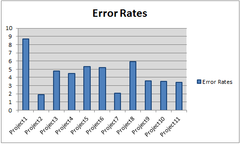
How many of Tufte's rules does this chart violate? Lots.
- The first thing I notice is the legend which doesn't add any clarity.
- Then the X-axis labels have a lot of redundant wording ("project")
- There's no label for the X or Y axis
- The gridlines are dark (non-data ink)
- The lines around the plot area don't add any value
- The dark X and Y Axis lines don't add value
- The dark lines around each bar don't add to the clarity either
If we clean all of this up, we get a more pleasing chart:
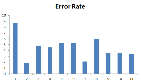
It's getting better, but is there a better order to this data other than project number? Yes, of course: descending error rates!
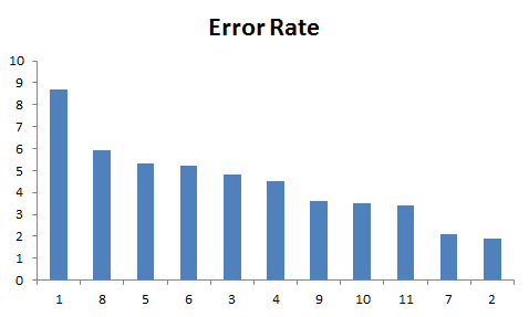
This chart is an improvement. The chart scale enhances the difference between the highest and lowest project defect ratio. The pareto chart can do an even better job of presenting this information:
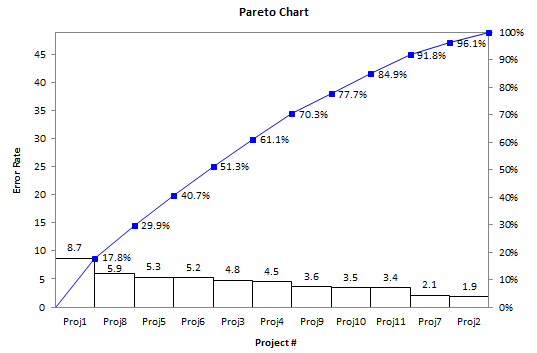
The pareto chart changes the scale for the bars and adds a cumulative line graph to show overall contribution of each bar. Now I still might want to know more about the projects: was project 1 small and project 8 huge (i.e., more errors). It might be more interesting to look at the total number of errors, not just the error rate.
Here's My Point
The goal of every graph is to tell a story, advance an idea, or make a business case for spending money or taking action. The goal is to simplify and clarify the presentation of your story using the design principles Tufte expresses so elegantly in his book:
What is to be sought in designs for the display of information is the clear portrayal of complexity. Not the complication of the simple.
If you're interested, order a copy from Amazon: The Visual Display of Quantitative Information.
Stop using old technology!
Upgrade Your Excel and Data Analysis Skills to Smart Charts Using QI Macros.
Track Data Over Time
Line Graph
Control Chart
Compare Categories
Pie Chart
Pareto Chart
Analyze Variation
Bar or Column Chart
Histogram
QI Macros add-in for Excel makes creating smart charts a snap.
Join 100,000+ Users
in 80 Countries
![]()
