Using QI Macros to Compare Data
Using Blank Rows to Make Comparisons
Did you know that if you add a blank row in your data before you run a control chart macro it will calculate two different sets of control limits? One set will be calculated using the data before the blank row and the second set will be calculated using the data after the blank row.
This functionality is most commonly used to show a process change on a control chart. However, many customers use it to compare two different processes side by side. If you are in healthcare, you could compare data for several different doctors, hospitals, floors, etc. If you are in manufacturing, you could compare data from different machines, lots, batches, etc. This functionality is illustrated in the following case study which uses Dr. Sophronia Ward's Brain Teaser column "Yield Confusion" in the November 2005 issue of Quality Magazine.
Case Study - Comparing Data from Different Machines
Background
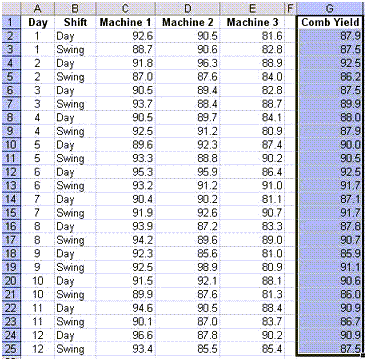
A production superintendent has 3 machines that polish chrome parts. One of his customers has asked that he include a control chart for the yield of their chrome parts to accompany each shipment. He has decided to construct a control chart using the combined data from all three machines even though the parts sent to this customer are only produced on machine 1.
Download the data for this example
What does a control chart run on the combined data tell you? To determine this, select the data in the Combined Yield column and run an XmR chart.
Note: The "Combined Yield" data in Dr. Ward's case study does not represent the average of the yields from the three machines. This is probably due to two reasons: The machine data is stated in percentages, not actual yields, and the production on each machine varies from the others. As a result, an XmR chart is run on the Combined Yield data instead of an XbarR chart run on the data of the three machines.
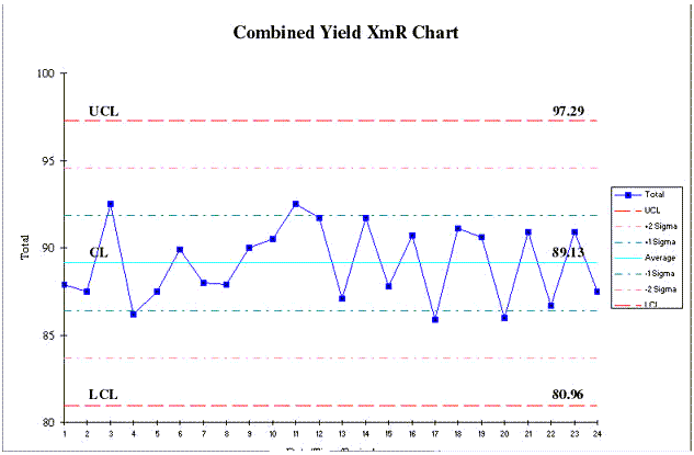
The control chart shows an average combined yield of 89.13 with no unstable points or conditions.
What problems might be encountered by using the combined data?
The problem with running this analysis on combined data is that problems with each individual machine become invisible. High and low values between machines offset each other and "average out". In this example, the problem is magnified since the customer only received parts from machine 1.
Since the parts are created using three different machines, the data for each machine should be analyzed separately and compared to the other two machines. There are several ways to do this using QI Macros.
- Run separate XmR charts on each set of data.
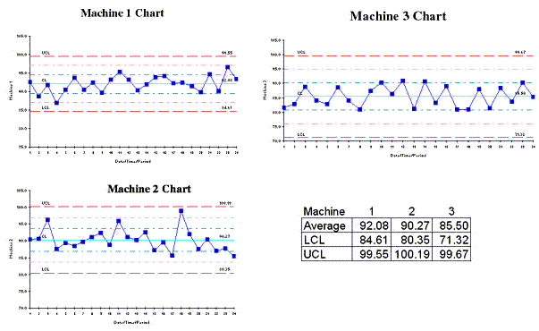
This will give you the average, UCL and LCL values for each data set but it is hard to see differences between the three machines.
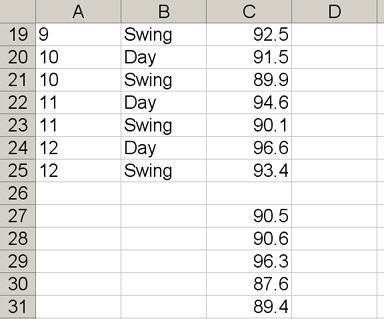
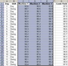
- Use the blank row function in QI Macros to show data for these machines side by side on the same chart. To do this you will first need to reorganize your data. Use Excel's cut and paste functions to move the machine 2 and machine 3 data below the machine 1 data in the same column. Leave a blank row between the data for each machine.
Now select the data and run an XmR chart. Use the text box tool to label the data for each machine.
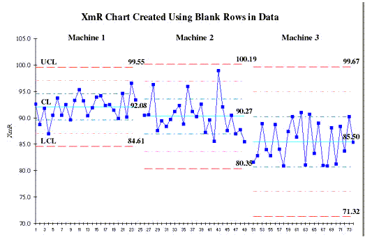
These side by side charts make it much easier to compare machines. You can easily see that the average yield for machine 3 is lower than machines 1 and 2. You can also tell how much wider the control limits are for machine 3. This means there is much more variation in the yields for machine 3.
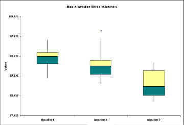
- You can also use the Box and Whisker Plot to compare the machines side by side.
To run a Box and Whisker Plot, the data for each machine must be in a separate column. Select the data for all 3 machines and then select "Box & Whisker" from the QI Macros menu.
Here's the Point
If you are analyzing data in the aggregate, don't stop there. Break it apart by department, location, machine, doctor, teller, programmer, etc. You'll be surprised at what you learn and you'll be more likely to find the 4% of the problem that will deliver 50% of the benefits. Remember you've got to drill down to find the hidden goldmine in your business.
Stop using old technology!
Upgrade Your Excel and Data Analysis Skills to Smart Charts Using QI Macros.
Track Data Over Time
Line Graph
Control Chart
Compare Categories
Pie Chart
Pareto Chart
Analyze Variation
Bar or Column Chart
Histogram
QI Macros add-in for Excel makes creating smart charts a snap.
Join 100,000+ Users
in 80 Countries
![]()
